

最近一段时间在不断升级自己的策略,需要经常查看历史k线图,结合策略查找回撤原因.这里使用的是maptlotlib画k线图.添加了键鼠控制,会方便很多.有需要的老板自行下载体验.码力强的老板多交流斧正.希望vnpy越办越好,论坛里的老板收获多多.
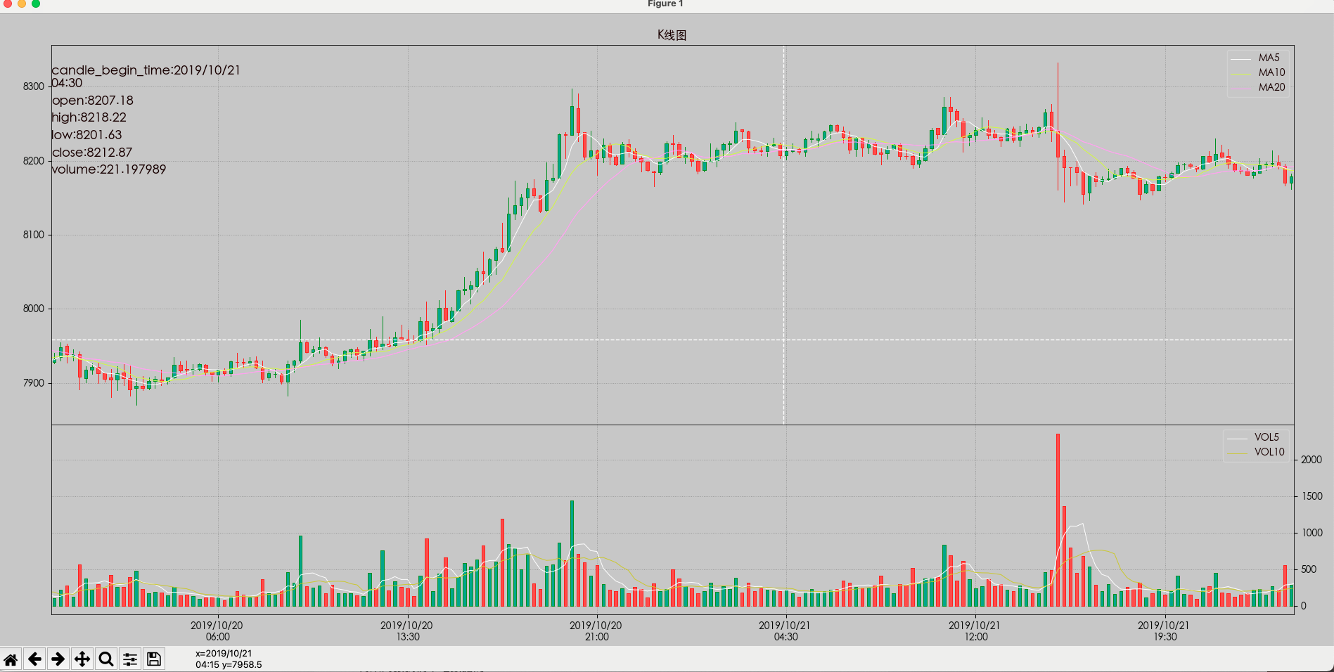
成品图
'''
基于matplotlib画历史k线图
1.这py文件有我喜欢用的macd和kdj指标,喜欢的用的可以根据2条有选择的去掉注释即可.
2.使用macd和kdj副图 可以添加注释掉88-89行的双图,把92-95行,160-183行注释去掉;
本代码使用的是整理回测之后的h5文件
'''
import numpy as np
import pandas as pd
import matplotlib.pyplot as plt
import matplotlib.ticker as ticker  # 用于日期刻度定制
from matplotlib.widgets import Cursor  # 处理鼠标
from matplotlib import colors as mcolors  # 用于颜色转换成渲染时顶点需要的颜色格式
from matplotlib.collections import LineCollection, PolyCollection  # 用于绘制直线集合和多边形集合


# 自定义画图时间段:
from_date = '2019-10-19'
end_date = '2019-10-23'

# 读入历史数据 ===========================导入数据
path = '/Volumes/sylvia/AdairPycharma/s_data center/suoyou_time/rb2202-SHFE-15m.h5'
df = pd.read_hdf(path, skiprows=1)
print(df)
df = df[df['data_times'] >= pd.to_datetime(from_date)]
df = df[df['data_times'] <= pd.to_datetime(end_date)]

## pandas将时间戳转换为字符串
df['data_times'] = df['data_times'].dt.strftime('%Y/%m/%d \n%H:%M')  # %Y-%m-%d %H:%M:%S


# 计算指标  # 计算MACD和KDJ(没有使用talib,有缺陷)
def calc_macd(df, fastperiod=12, slowperiod=26, signalperiod=9):
    ewma12 = df['close'].ewm(span=fastperiod, adjust=False).mean()
    ewma26 = df['close'].ewm(span=slowperiod, adjust=False).mean()
    df['dif'] = ewma12 - ewma26
    df['dea'] = df['dif'].ewm(span=signalperiod, adjust=False).mean()
    df['bar'] = (df['dif'] - df['dea']) * 2
    # df['macd'] = 0
    # series = df['dif']>0
    # df.loc[series[series == True].index, 'macd'] = 1
    return df

def calc_kdj(df):
    low_list = df['low'].rolling(9, min_periods=9).min()
    low_list.fillna(value=df['low'].expanding().min(), inplace=True)
    high_list = df['high'].rolling(9, min_periods=9).max()
    high_list.fillna(value=df['high'].expanding().max(), inplace=True)
    rsv = (df['close'] - low_list) / (high_list - low_list) * 100
    df['k'] = pd.DataFrame(rsv).ewm(com=2).mean()
    df['d'] = df['k'].ewm(com=2).mean()
    df['j'] = 3 * df['k'] - 2 * df['d']

# #     # df['kdj'] = 0
# #     # series = df['k']>df['d']
# #     # df.loc[series[series == True].index, 'kdj'] = 1
# #     # # df.loc[series[(series == True) & (series.shift() == False)].index, 'kdjcross'] = 1
# #     # # df.loc[series[(series == False) & (series.shift() == True)].index, 'kdjcross'] = -1
    return df

y0 = df.iloc[:, 0].tolist()
columns = df.columns
vmax = max(df['volume'].tolist())
calc_macd(df)  # 计算MACD值,数据存于DataFrame中
calc_kdj(df)  # 计算KDJ值,数据存于DataFrame中

# 日期转换成整数序列 ==================================时间序列
date_tickers = df['data_times'].values
df['data_times'] = range(0, len(df))  # 日期改变成序号
matix = df.values  # 转换成绘制蜡烛图需要的数据格式(date, open, close, high, low, volume)
xdates = matix[:, 0]  # X轴数据(这里用的天数索引)

# 设置外观效果 =========================绘图属性
plt.rc('font', family='Heiti TC')  # 用中文字体,防止中文显示不出来  macos换成 family='Heiti TC',windows用 family='Microsoft YaHei'
plt.rc('figure', fc='#BBBBBB')  # 绘图对象背景图
plt.rc('text', c='#100000')  # 文本颜色  c='#800000'
plt.rc('axes', axisbelow=True, xmargin=0, fc='#BBBBBB', ec='k', lw=0.6, labelcolor='#800000',
       unicode_minus=False)  # 画图部分,坐标轴属性(置底,左边无空隙,背景色,边框色,线宽,文本颜色,中文负号修正)
plt.rc('xtick', c='#080908')  # x轴刻度文字颜色
plt.rc('ytick', c='#080908')  # y轴刻度文字颜色
plt.rc('grid', c='#080908', alpha=0.3, ls=':', lw=0.7)  # 网格属性(颜色,透明值,线条样式,线宽)
plt.rc('lines', lw=0.7)  # 全局线宽

# 创建绘图对象和4个坐标轴
fig = plt.figure(figsize=(19, 9))
left, width = 0.04, 0.93
# 双图 不含macd,kdj,注销四图两行代码
ax1 = fig.add_axes([left, 0.35, width, 0.6])  # left, bottom, width, height
ax2 = fig.add_axes([left, 0.05, width, 0.3], sharex=ax1)  # 共享ax1轴

# 四图 含macd,kdj
# ax1 = fig.add_axes([left, 0.6, width, 0.35])  # left, bottom, width, height
# ax2 = fig.add_axes([left, 0.45, width, 0.15], sharex=ax1)  # 共享ax1轴
# ax3 = fig.add_axes([left, 0.25, width, 0.2], sharex=ax1)  # 共享ax1轴
# ax4 = fig.add_axes([left, 0.05, width, 0.2], sharex=ax1)  # 共享ax1轴
plt.setp(ax1.get_xticklabels(), visible=False)  # 使x轴刻度文本不可见,因为共享,不需要显示
# plt.setp(ax2.get_xticklabels(), visible=False)  # 使x轴刻度文本不可见,因为共享,不需要显示
# plt.setp(ax3.get_xticklabels(), visible=False)  # 使x轴刻度文本不可见,因为共享,不需要显示
# plt.setp(ax4.get_xticklabels(), visible=False)  # 使x轴刻度文本不可见,因为共享,不需要显示

# 绘制蜡烛图
def format_date(x, pos=None): return '' if x < 0 or x > len(date_tickers) - 1 else date_tickers[int(x)]  # 日期格式化函数,根据天数索引取出日期值
ax1.xaxis.set_major_formatter(ticker.FuncFormatter(format_date))  # 设置自定义x轴格式化日期函数
ax1.xaxis.set_major_locator(ticker.MultipleLocator(max(int(len(df) / 15), 5)))  # 横向最多排15个左右的日期,最少5个,防止日期太拥挤
# mpf.candlestick_ochl(ax1, matix, width=0.5, colorup='#ff3232', colordown='#54fcfc')
# # 下面这一段代码,替换了上面注释的这个函数,因为上面的这个函数达不到同花顺的效果
opens, highs, lows, closes = matix[:, 1], matix[:, 2], matix[:, 3], matix[:, 4]  # 取出ochl值
avg_dist_between_points = (xdates[-1] - xdates[0]) / float(len(xdates))  # 计算每个日期之间的距离
delta = avg_dist_between_points / 4.0  # 用于K线实体(矩形)的偏移坐标计算
barVerts = [((date - delta, open), (date - delta, close), (date + delta, close), (date + delta, open)) for
            date, open, close in zip(xdates, opens, closes)]  # 生成K线实体(矩形)的4个顶点坐标
rangeSegLow = [((date, low), (date, min(open, close))) for date, low, open, close in
               zip(xdates, lows, opens, closes)]  # 生成下影线顶点列表
rangeSegHigh = [((date, high), (date, max(open, close))) for date, high, open, close in
                zip(xdates, highs, opens, closes)]  # 生成上影线顶点列表
rangeSegments = rangeSegLow + rangeSegHigh  # 上下影线顶点列表
cmap = {True: mcolors.to_rgba('#009977', 1.0),
        False: mcolors.to_rgba('#ff3333', 1.0)}  # K线实体(矩形)中间的背景色(True是上涨颜色,False是下跌颜色)
inner_colors = [cmap[opn < cls] for opn, cls in zip(opens, closes)]  # K线实体(矩形)中间的背景色列表
cmap = {True: mcolors.to_rgba('g', 1.0),
        False: mcolors.to_rgba('r', 1.0)}  # K线实体(矩形)边框线颜色(上下影线和后面的成交量颜色也共用)
updown_colors = [cmap[opn < cls] for opn, cls in zip(opens, closes)]  # K线实体(矩形)边框线颜色(上下影线和后面的成交量颜色也共用)列表
ax1.add_collection(LineCollection(rangeSegments, colors=updown_colors, linewidths=0.5,
                                  antialiaseds=False))  # 生成上下影线的顶点数据(颜色,线宽,反锯齿,反锯齿关闭好像没效果)
ax1.add_collection(PolyCollection(barVerts, facecolors=inner_colors, edgecolors=updown_colors, antialiaseds=False, linewidths=0.5))  # 生成多边形(矩形)顶点数据(背景填充色,边框色,反锯齿,线宽)


# 绘制均线
mav_colors = ['#ffffff', '#d4ff07', '#ff80ff', '#00e600', '#02e2f4', '#ffffb9', '#2a6848']  # 均线循环颜色
mav_period = [5, 10, 20]  # 定义要绘制的均线周期,可增减  5, 10, 20, 30, 60, 120, 180
n = len(df)
for i in range(len(mav_period)):
    if n >= mav_period[i]:
        mav_vals = df['close'].rolling(mav_period[i]).mean().values
        ax1.plot(xdates, mav_vals, c=mav_colors[i % len(mav_colors)], label='MA' + str(mav_period[i]))
ax1.set_title('K线图')  # 标题
# ax1.set_yticks(df['close'])  # 设置y轴刻度
ax1.grid(True)  # 画网格
ax1.legend(loc='upper right')  # 图例放置于右上角


# 绘制成交量和成交量均线(5日,10日)
# ax2.bar(xdates, matix[:, 5], width= 0.5, color=updown_colors) # 绘制成交量柱状图
barVerts = [((date - delta, 0), (date - delta, vol), (date + delta, vol), (date + delta, 0)) for date, vol in
            zip(xdates, matix[:, 5])]  # 生成K线实体(矩形)的4个顶点坐标
ax2.add_collection(PolyCollection(barVerts, facecolors=inner_colors, edgecolors=updown_colors, antialiaseds=False,
                                  linewidths=0.5))  # 生成多边形(矩形)顶点数据(背景填充色,边框色,反锯齿,线宽)
if n >= 5:  # 5日均线,作法类似前面的均线
    vol5 = df['volume'].rolling(5).mean().values
    ax2.plot(xdates, vol5, c='w', label='VOL5')
if n >= 10:  # 10日均线,作法类似前面的均线
    vol10 = df['volume'].rolling(10).mean().values
    ax2.plot(xdates, vol10, c='y', label='VOL10')
ax2.yaxis.set_ticks_position('right')  # y轴显示在右边
ax2.legend(loc='upper right')  # 图例放置于右上角
ax2.grid(True)  # 画网格
# ax2.set_ylabel('成交量') # y轴名称


# # 绘制MACD
# difs, deas, bars = matix[:, 6], matix[:, 7], matix[:, 8]  # 取出MACD值
# ax3.axhline(0, ls='-', c='g', lw=0.5)  # 水平线
# ax3.plot(xdates, difs, c='w', label='DIFF')  # 绘制DIFF线
# ax3.plot(xdates, deas, c='y', label='DEA')  # 绘制DEA线
# # ax3.bar(xdates, df['bar'], width= 0.05, color=bar_colors) # 绘制成交量柱状图(发现用bar绘制,线的粗细不一致,故使用下面的直线列表)
# cmap = {True: mcolors.to_rgba('r', 1.0), False: mcolors.to_rgba('g', 1.0)}  # MACD线颜色,大于0为红色,小于0为绿色
# bar_colors = [cmap[bar > 0] for bar in bars]  # MACD线颜色列表
# vlines = [((date, 0), (date, bars[date])) for date in range(len(bars))]  # 生成MACD线顶点列表
# ax3.add_collection(
#     LineCollection(vlines, colors=bar_colors, linewidths=3, antialiaseds=False))  # 生成MACD线的顶点数据(颜色,线宽,反锯齿)
# ax3.legend(loc='upper right')  # 图例放置于右上角
# ax3.grid(True)  # 画网格
#
#
# # 绘制KDJ
# K, D, J = matix[:, 9], matix[:, 10], matix[:, 11]  # 取出KDJ值
# ax4.axhline(0, ls='-', c='g', lw=0.5)  # 水平线
# ax4.yaxis.set_ticks_position('right')  # y轴显示在右边
# ax4.plot(xdates, K, c='y', label='K')  # 绘制K线
# ax4.plot(xdates, D, c='c', label='D')  # 绘制D线
# ax4.plot(xdates, J, c='m', label='J')  # 绘制J线
# ax4.legend(loc='upper right')  # 图例放置于右上角
# ax4.grid(True)  # 画网格


# cursor = MultiCursor(fig.canvas, (ax1, ax2,), useblit=False, color='w', linewidth=1, linestyle='--',horizOn=True, vertOn=True) # 全图十字
cursor = Cursor(ax1, useblit=False, color='w', linewidth=1, linestyle='--') # 十字光标  图1 开启  颜色 线宽 线形

# 鼠标互交
y1 = df.iloc[:, 1].tolist()
y2 = df.iloc[:, 2].tolist()
y3 = df.iloc[:, 3].tolist()
y4 = df.iloc[:, 4].tolist()
y5 = df.iloc[:, 5].tolist()
len_y = len(y0)
x = range(len_y)
y = [y0, y1, y2, y3, y4, y5]
text = []
for yi in y:
    _y = [yi[-1]] * len_y
    texti = plt.text(len_y - 1, yi[-1], str(yi[-1]), fontsize=13)
    text += [texti]


def motion(event):
    axtemp = event.inaxes
    x_min, x_max = axtemp.get_xlim()
    try:
        for i in range(len(y)):
            yi = y[i]
            texti = text[i]
            temp = yi[int(np.round(event.xdata))]

            for j in range(len_y):
                _y[j] = temp

            texti.set_position((x_min, vmax * 3 - (vmax) / 10 * i))
            texti.set_text(columns[i] + ':' + str(temp))
            # print(texti)

            fig.canvas.draw_idle()  # 绘图动作实时反映在图像上
    except:
        pass


# 键盘方向键左右拖动
def on_key_press(event):
    axtemp = event.inaxes
    x_min, x_max = axtemp.get_xlim()
    step = (x_max - x_min) // 20 + 1
    if event.key == 'right':
        axtemp.set(xlim=(x_min + step, x_max + step))
    elif event.key == 'left':
        axtemp.set(xlim=(x_min - step, x_max - step))
    x_min, x_max = axtemp.get_xlim()
    try:
        for i in range(len(y)):
            yi = y[i]
            texti = text[i]
            temp = yi[int(np.round(event.xdata))]

            for j in range(len_y):
                _y[j] = temp

            texti.set_position((x_min, vmax * 3 - (vmax) / 10 * i))
            texti.set_text(columns[i] + ':' + str(temp))
    except:
        pass
    fig.canvas.draw_idle()


# 滚轮缩放
def scroll(event):
    axtemp = event.inaxes
    x_min, x_max = axtemp.get_xlim()
    fanwei_x = (x_max - x_min) / 10

    if event.button == 'up':
        axtemp.set(xlim=(x_min + fanwei_x, x_max - fanwei_x))
        ax1.xaxis.set_major_locator(
            ticker.MultipleLocator(max(int((x_max - x_min) / 8), 5)))  # 横向最多排8个左右的日期,最少5个,防止日期太拥挤
    elif event.button == 'down':
        axtemp.set(xlim=(x_min - fanwei_x, x_max + fanwei_x))
        ax1.xaxis.set_major_locator(
            ticker.MultipleLocator(max(int((x_max - x_min) / 8), 5)))  # 横向最多排8个左右的日期,最少5个,防止日期太拥挤
    x_min, x_max = axtemp.get_xlim()
    try:

        for i in range(len(y)):
            yi = y[i]
            texti = text[i]

            temp = yi[int(np.round(event.xdata))]
            for j in range(len_y):
                _y[j] = temp

            texti.set_position((x_min, vmax * 3 - (vmax) / 10 * i))
            texti.set_text(columns[i] + ':' + str(temp))

    except:
        pass
    fig.canvas.draw_idle()  # 绘图动作实时反映在图像上

# 添加事件处理函数
fig.canvas.mpl_connect('motion_notify_event', motion)
fig.canvas.mpl_connect('key_press_event', on_key_press)
fig.canvas.mpl_connect('scroll_event', scroll)

plt.show()
plt.close()  # 关闭plt,释放内存